Give Your Vision Wings: Strategy, Identity, and a Design System
Give your vision wings means a brand people can recognize, not a louder logo. InterGlobal is a Digital Intelligence Company in Dallas. This guide is about design and branding: brand strategy, visual identity, and a design system. Here, a design system means the type, the colors, the layouts, and the pieces you reuse. It is not a software product.
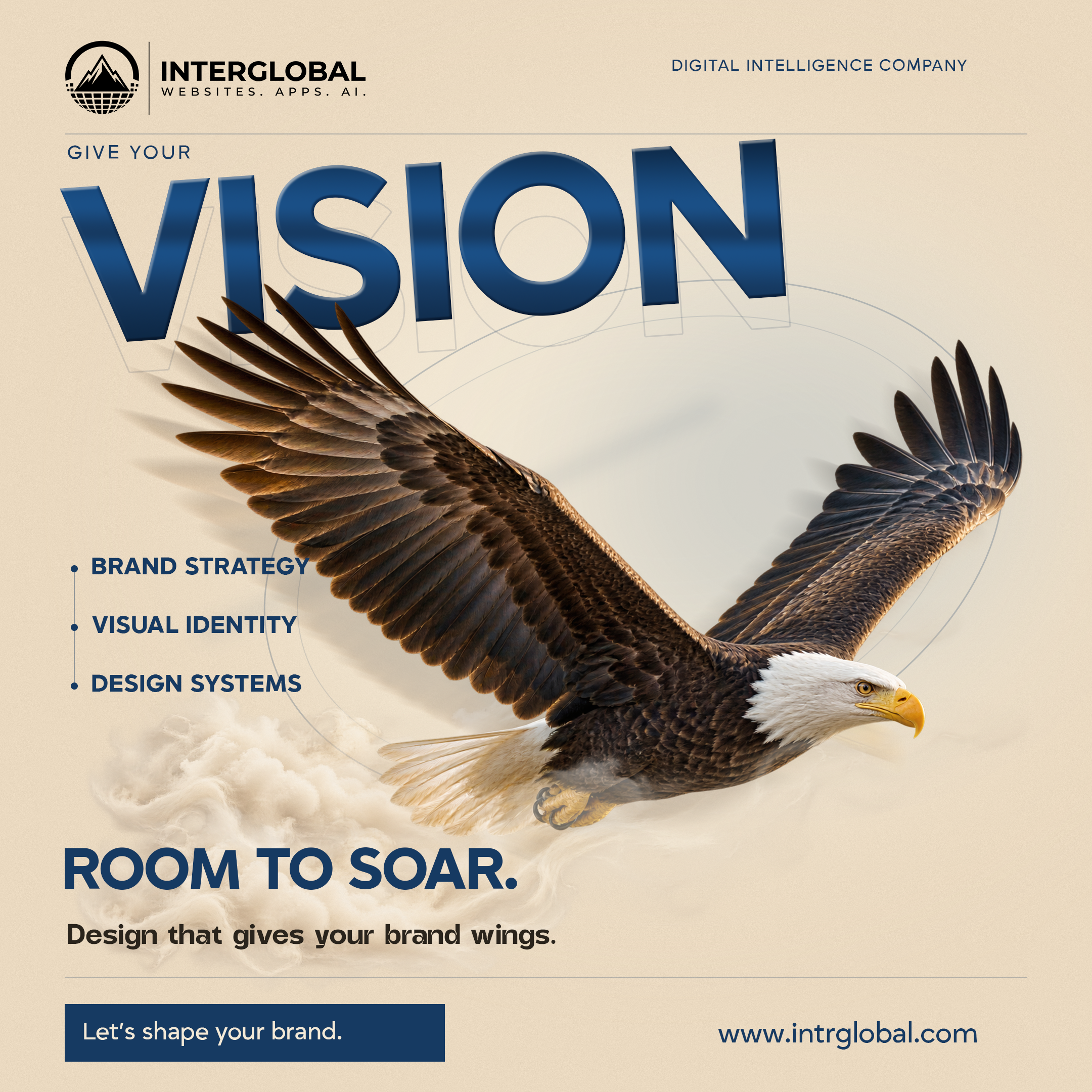
The picture is a working metaphor. An eagle holds one pose. A softer echo sits behind it. The wings do not flap, and the face does not move. The echo is its own layer. The sharp bird is its own layer. Together they stand for a vision that has a shape you can see. They are not a promise that a brand will grow, and they are not a client result.
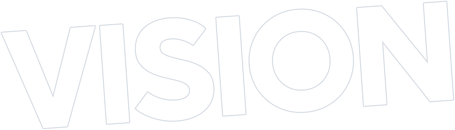
The word Vision is set twice. One copy is the sculpted navy word. The other is a quiet outline just behind it. Both copies say the same word. Under the bird, three labels sit on one line of thought. Brand strategy. Visual identity. Design systems. The line under them says design gives the brand wings. The button says Let's shape your brand. The address on the poster is www.intrglobal.com.
The square under the film is that same poster, rebuilt from all 30 pieces, on the same 2160 by 2160 canvas. It is not a second copy of the video. Replay runs the entrance once, then holds the poster. If you prefer less motion, the finished poster appears at once. The button and the website stay real links either way.
Quick answer: Name what the brand stands for and who it needs to reach before you pick colors or draw a logo. Strategy turns that direction into one clear idea. Visual identity gives the idea a logo, type, color, and art direction. A design system carries those choices across the site, the campaigns, and the everyday notes.
- Write the purpose and the audience before the palette.
- Keep the logo, the type, and the color as one identity, not three unrelated styles.
- Reuse the same visual rules so the work still looks like one brand.
What's in this article?
A clear vision
A clear vision is where a memorable brand begins. Memorable, here, means someone can tell your work from the work next to it. It does not mean famous, and it does not mean a certain number of customers. The vision is the direction. Design is how that direction becomes something a person can recognize without a paragraph of explanation.
The eagle is the direction taking a shape. The sharp bird is the identity you can point at. The blurred echo is the motion around it, already in the file. Nothing on the bird is animated as a wing, a feather, or a face. The orbit lines and the mist are separate layers. They add depth. They do not invent a second bird.
Effects stay with the layer that owns them. The blur, the grain, the light, and the bevel are already in the exported art. The film and the square show those files at full strength. They do not add a second blur or a second fade on top of the one in the picture.
Purpose before style
Before choosing colors or drawing a logo, define what your brand stands for and who it needs to reach. Those are two different sentences. The first is the purpose. The second is the audience. A palette chosen before either sentence is a mood, not a brand. The film puts the words Purpose and Audience in the open paper above the headline, then clears them. They are not part of the finished poster.
Style first
A color and a typeface get picked because they look current. The purpose is written later, if it is written at all. The pieces drift apart the first time a new page is made.
Direction first
The purpose and the audience are written in plain sentences. Color, type, and the logo have to serve those sentences. A new page starts from the same rules.
Design gives that vision a shape people can recognize. If you cannot say the shape in one sentence, the visual work does not have a target yet.
Brand strategy
Brand strategy turns that direction into a clear idea for your identity. Strategy, in this guide, is that idea. It is not a technology diagram and not a list of tools. It answers what you stand for, who the work is for, and what should feel distinct. The poster marks it as the first point on the line: Brand strategy.
1. Purpose
What the brand is for, in one sentence a person outside the company can repeat.
2. Audience
Who needs to recognize it. A label as broad as "everyone" is not an audience yet.
3. Distinction
The one quality a person should feel before they read a paragraph. If you need three qualities, you do not have the idea yet.
This is a way of deciding, not a claim about a finished brand. The article does not name a client, a before-and-after, or a result. InterGlobal can help shape the strategy. The sentences still have to come from the business.
Visual identity
Visual identity brings the idea to life through a logo, typography, color, and art direction. Those four are one identity. A logo that does not share its color or its type with the rest of the work is a separate mark, not an identity. On this poster the identity is the one you are looking at: the InterGlobal mark, the navy word Vision, the cream field, and the photographic eagle as art direction. The feather and beak colors belong to the photograph. They are not a new set of interface colors.
1. Logo
The mark people should still recognize when the rest of the layout changes. It stays the real mark. It is not redrawn to fit a trend.
2. Type
One family for the short lines, one for the reading text. The poster uses that split. A third family for a single headline is how a page starts to look borrowed.
3. Color and art
A short palette, used the same way each time, plus the kind of picture the brand allows. Art direction is that choice. It is not a new illustration for every post.
Web design is one place that identity has to hold. A site that uses a different type, a different blue, and a different logo treatment is a second brand, even when the name in the header matches.
A design system
A design system carries that identity across your website, campaigns, and everyday communication. In this article the words mean visual rules and reusable pieces. The same type sizes. The same gaps. The same button. The same way a photograph sits on the cream field. They do not mean a database, a dashboard, or a product you log into.
1. Rules
How big the headline is, how much space sits under it, and which color is for a button. Written down, not remembered.
2. Pieces
The logo, the button, the rule line, and the caption, ready to use again. A piece that gets restyled on every page is not in the system yet.
3. Use
The site, a campaign poster, and a short note should still look related. The goal is not more decoration. It is a visual language that feels distinct and works together.
Do not treat a template as a system. A downloaded kit can look finished and still have nothing to do with the purpose you wrote. If the type, the color, and the pictures do not come from the strategy, you have decoration with matching corners.
The three labels on the poster are the order of the work. Strategy first. Identity next. The system last, so it has something real to carry. Reversing that order is how teams end up with a component library and no idea.
What to bring to a branding brief
A useful brief is short enough to read and specific enough to design from. InterGlobal helps shape the strategy and the design behind the visual language. The brief is still yours. These are the lines worth writing before a call.
What you stand for
One sentence. If it could sit on a competitor's site without a change, it is not specific yet.
Who should recognize you
The person, not a market category. What they already believe. What they need to see before they trust the work.
What must stay
The name, a mark you will not replace, a color a customer already knows. Say it so the new work does not throw it away by accident.
Where it has to appear
The site, a proposal, a social post, a sign. The system only helps if you name the places it has to hold.
Give your vision room to soar with design that gives the brand wings. Room, here, means the identity can show up in more than one format without being redrawn each time. It does not mean the business will expand, and it does not mean every future campaign is included. Explore the next brand direction at www.intrglobal.com.
Bring three real pieces of the current brand. The site header, one recent post, and one document a customer actually sees. The gaps between those three are the brief. A mood board with no current work hides the inconsistency you already have.
The poster, in motion
Replay walks the 30 pieces in groups, then holds. The cream field, the paper grain, and the soft light come in first, with the logo, the company line, and the header rule. Vision reveals on a diagonal, and the outline follows a moment later. The eagle and its echo move together, a short distance and a slight tilt, then stop in the approved pose. The rear mist follows. The orbit lines sweep in. Brand strategy, visual identity, and design systems resolve down the spine. The foreground mist, Room to soar, the support line, and the lower rule settle next. The button and www.intrglobal.com arrive last. The square holds the poster. It does not loop.























Want the direction checked against the brand you already have?
Book a call. We will talk through the purpose, the audience, and the visual rules the work should share.
Let's shape your brand.Cream, navy, and paper on this poster are the studio palette. The eagle belongs to the photograph. The written address is www.intrglobal.com.
This week
Key takeaways
- A memorable brand starts with a purpose and an audience, before colors or a logo.
- Visual identity is the logo, the type, the color, and the art direction, used as one idea.
- A design system here means those visual rules, reused. It is not a software platform.
- Let's shape your brand opens the booking section. www.intrglobal.com is the address.
Questions before the call
Why an eagle?
The bird stands for a vision that has taken a recognizable shape. It holds one pose. The softer echo is a separate layer. Nothing about the picture promises growth or speed.
What is a design system in this article?
The type, the colors, the layouts, and the pieces you reuse on the site, in campaigns, and in everyday notes. It is not a login, a database, or a dashboard.
Do we need a new logo first?
No. Start with what the brand stands for and who it is for. A logo comes after that idea is clear. An existing mark can stay if it still fits.
Will this match our website?
That is the point of the system. The same type, color, and picture rules should hold on the site and on the other places you named. This article does not claim a redesign is already done.
What does the button do?
Let's shape your brand opens the booking section at https://intrglobal.com/#book. www.intrglobal.com opens the studio site.
Why is Vision drawn twice?
One copy is the sculpted word. The other is a quiet outline. They are separate so the echo can follow the main word. Both say the same thing.
Why is there a square and a video?
The video is the narrated film. The square is the same design rebuilt from its 30 pieces, so you can replay the sequence without playing the film.
What if I prefer less motion?
The poster appears complete, and both links still work. Replay stays available when motion is allowed.
Let's shape your brand.
That is the line on the poster. It opens the booking section, and www.intrglobal.com stays the address.
Let's shape your brand.